Open data – you can see it, but now you can play with it!
| 11 November, 2013 | Rebecca Lawrence |
|
|
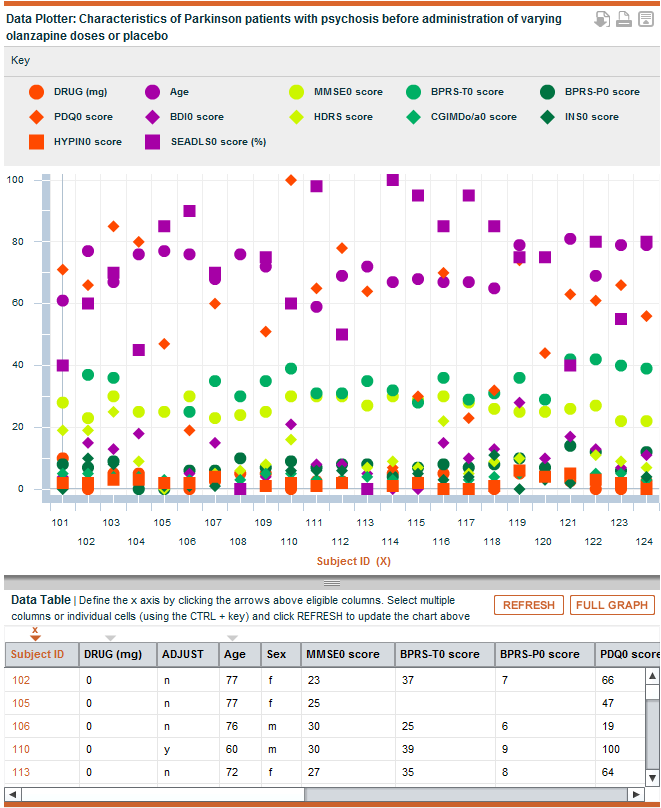
F1000Research is excited to showcase a beta version of our new data plotting tool, which enables referees and readers to visualise and play with the data in our articles ‘on the fly’. This tool can be currently seen on two datasets within two different articles: https://f1000research.com/articles/2-150/v1#plot and https://f1000research.com/articles/1-70/v1#plot.
One important aspect of publishing in F1000Research is that we ask authors to ensure the data underlying any findings is made publicly available alongside the article (with the exception of where this might compromise privacy or security). The concept of open data and data sharing is an important step in helping tackle the issues around lack of reproducibility of many published findings currently, as well as enabling data reuse.
Having the raw data is one thing, but knowing what is in the file is quite another. In some cases, it can take quite some effort to analyze the data and really understand what is being presented and to interpret it. However, with certain types of data, it is possible to get a good idea about the data quickly through a simple visualization of the dataset.
We have therefore taken one of the most common types of dataset in research articles, and built a plotting tool so that you can get an instant first-pass view of what is in the dataset. This tool will enable you to plot any CSV file containing numerical values as a scatter plot. You can select whichever parts of the spreadsheet you would like to plot – you can select whole columns or just specify particular values within different columns. This means you can easily start to see, for example, if there are any obvious outliers, whether there are any correlations in the data that were possibly missed by the authors, or whether the authors’ summary results, and hence their conclusions, make sense from the supporting data. We hope it will be particularly helpful for referees to quickly assess the underlying data and spot any obvious flaws in the data itself, or in the conclusions drawn. As a reader or a referee, you can download your version of the data plot and you will shortly be able to then import it into your referee report or to share it with others (e.g. tweet it).
This is an initial beta of the tool so the functionality is basic. We thought that rather than spending a lot of time perfecting the tool and adding extra features, we would first give you a taster of the possibilities and find out what you actually want to be able to do. So, have a play with the tool, think about some of the datasets that you produce or that you would expect to see in one of our papers, and then please tell us:
- What you particularly like about the current tool?
- What you particularly dislike about the current tool?
- What are the most common things you want to be able to do with spreadsheet datasets?
- What other features you would like us to add?
- What are the most common things you want to be able to do with other types of data (i.e. beyond CSV files)?
Please pass this call on as widely as possible. We think this is the start of a new way of thinking about articles and data, and so we want to develop it so that it is as useful and flexible as possible for authors, readers, researchers and reviewers.
|
|
