Not your Mercator's projection
| 28 January, 2011 | Richard P. Grant |
|
|
We like network maps. We’ve done them before.
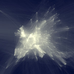
Via Mun-Keat at the Wellcome Trust, I came across an intriguing map of scientific collaborations, created by Olivier H. Beauchesne, from lists of co-authors in Elsevier journals. Essentially, each time authors from different cities appear on the same paper, a line connecting those cities appears on the map (it’s a little, but not much, more complex than that).
It’s fascinating how you can trace the outline of land masses for much of the world, although there are certain huge (dark) gaps: Russia and Australia stand out (or not) in particular. Even tiny New Zealand appears better connected than Australia (relatively speaking: the population of NZ is a sixth of its friend across the Tasman).
So it’s not simply a measure of research intensity, or output. It might be interesting to take data such as these and compare them with measures of research output, looking for any interesting correlations or patterns. You can’t do this with Beauchesne’s data unfortunately (blame Elsevier, apparently) but PubMed, for example, has lots of juicy APIs.
Download a huge high-resolution JPEG, or for real fun check out the zoomable map.
|
|